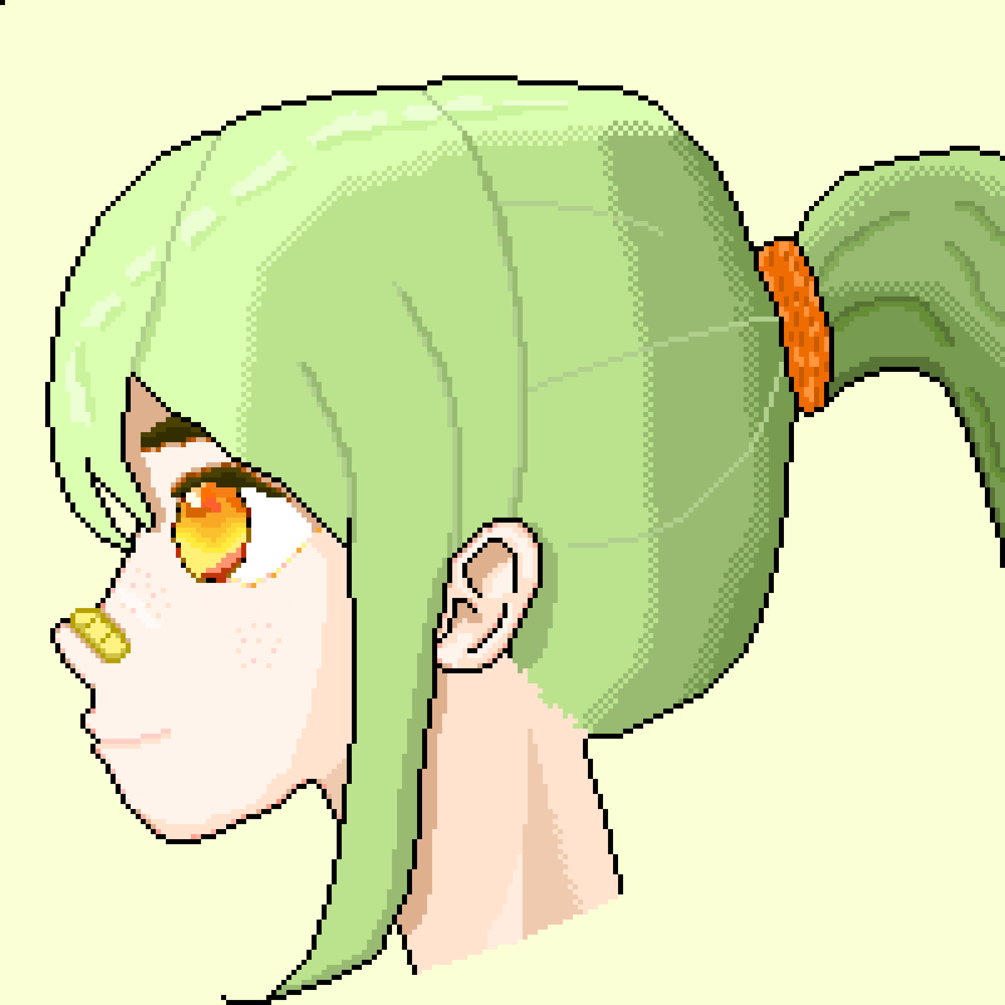
#70 Angels Calling
After doing pixels for around 1.5 years, maybe it's finally time to learn how you should actually do it. I stumbled across the course by Downvote, the guy who makes the most beautiful pixel animations I have ever seen.
My feelings are somewhat mixed. On one hand, Citrus likes to do everything his own way. I absolutely hate taking orders or listening to instructions. The Citrus way is to be lost until you know every corner of a place. I have navigation, or even take advice on how I should get somewhere. On the other hand, I really feel like I have to improve, like I'm falling behind. Maybe the course will help me better understand my mistakes and help me get better while there is still time for it.
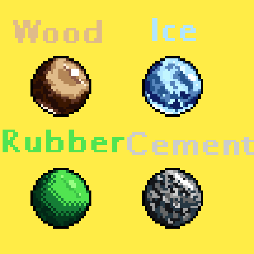
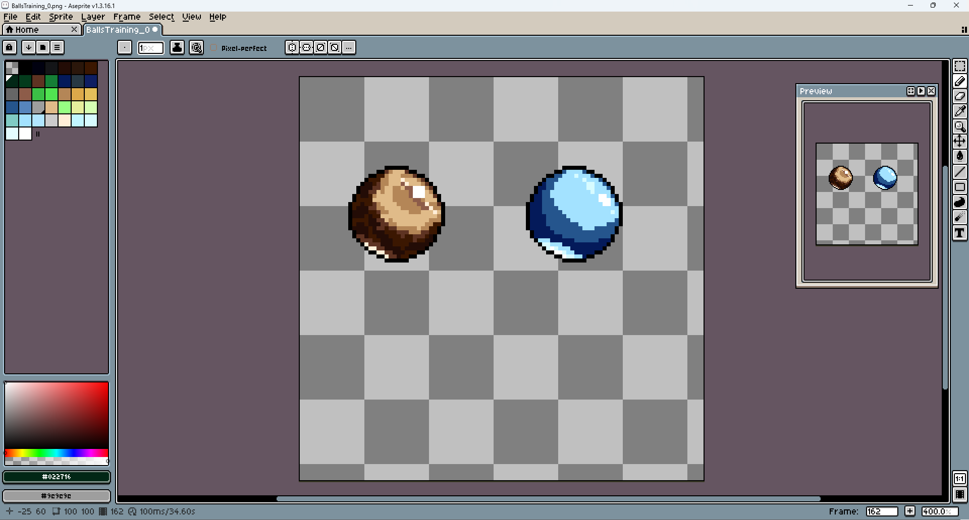
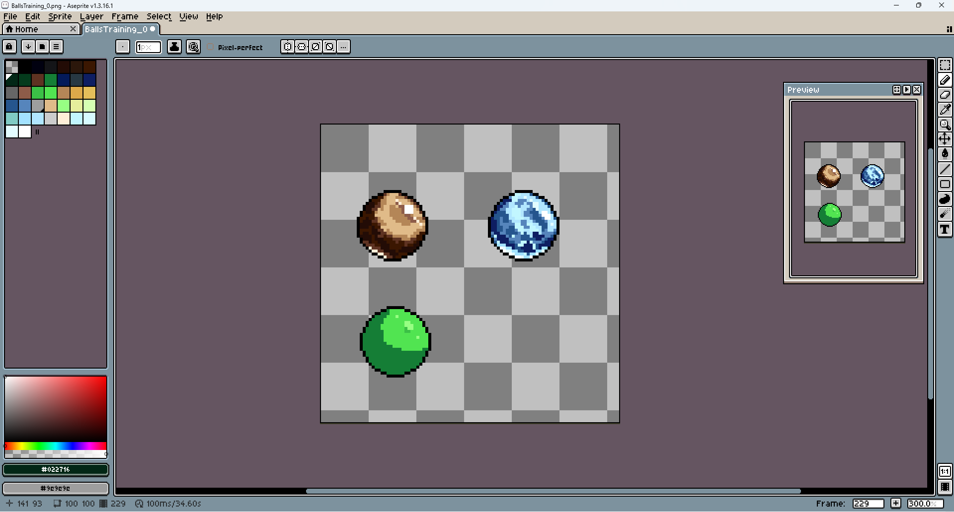
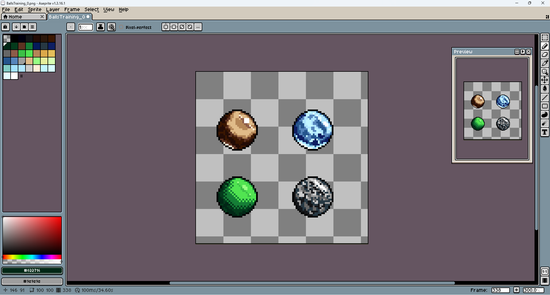
These four balls are supposed to help me train to recreate different materials. How rough and shiny they are and if they have some kind of pattern.

The pixeling style is also very different from my usual one. It tries to recreate the substance, based on the number, size, and variety of those little spots called clusters (every group of pixels is a cluster btw).

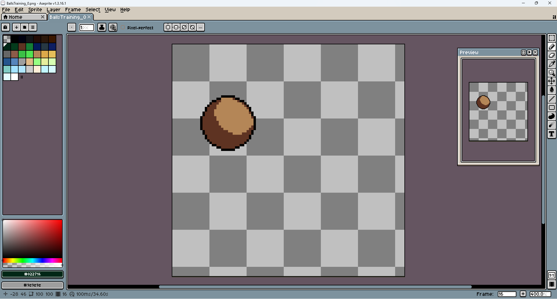
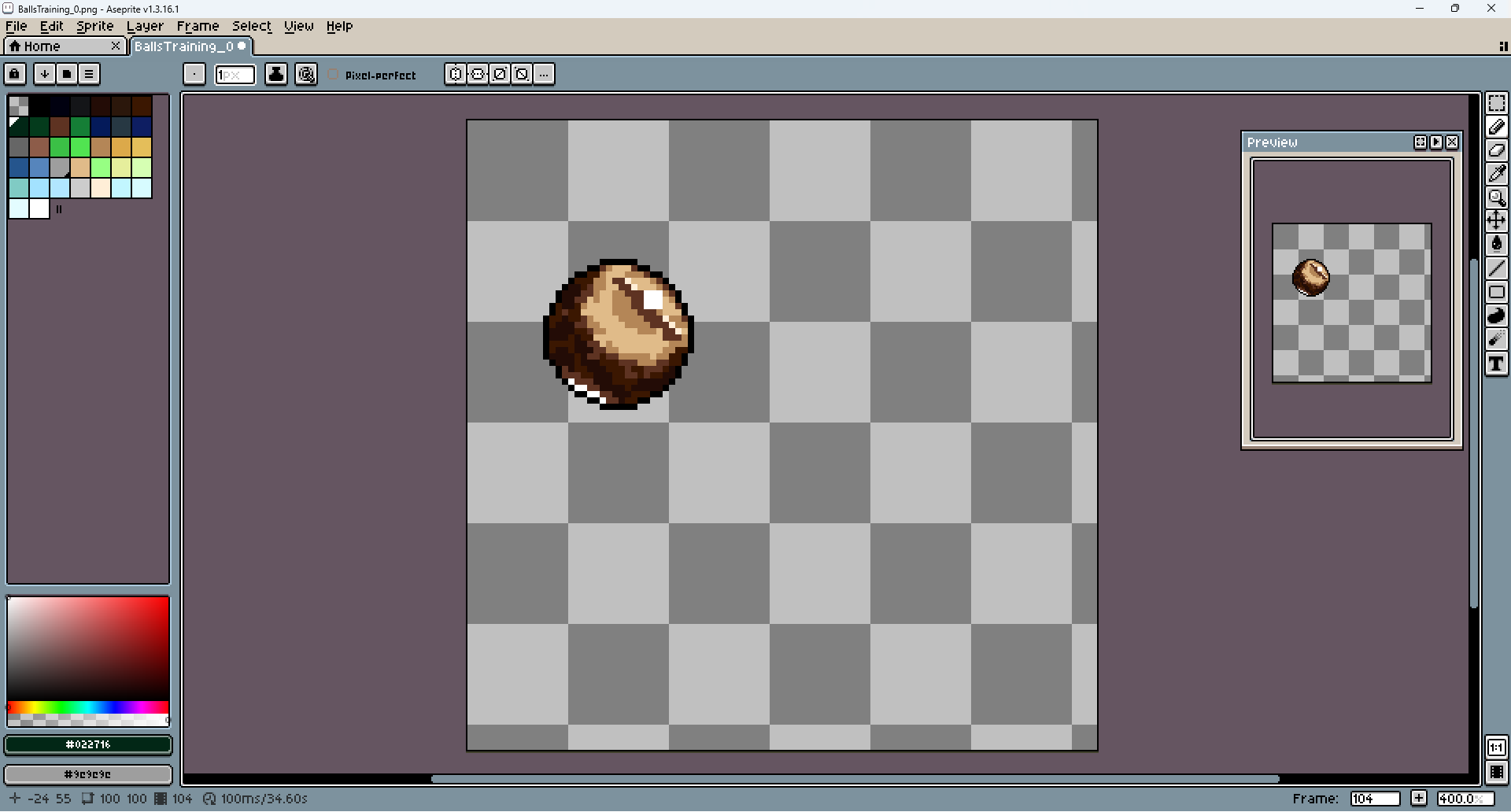
It's supposed to be a wooden ball, so I tried to give it the characteristic rings. You can also see that the colors are much more saturated and diversified. Normally I was using only one color and changing the saturation and brightness. But apparently you can achieve better results if you also change the colors themselves. It creates more contrast and lets you use fewer shades.
Another lesson: if the object is shiny, it not only has the shine on the side but also a darker line under it, as well as the little shine on the other side.

You can see me struggling to implement all of this at the same time.

I'm not sure if it looks like wood... maybe I should have added more rings at the top? Or make the one that is there smaller?

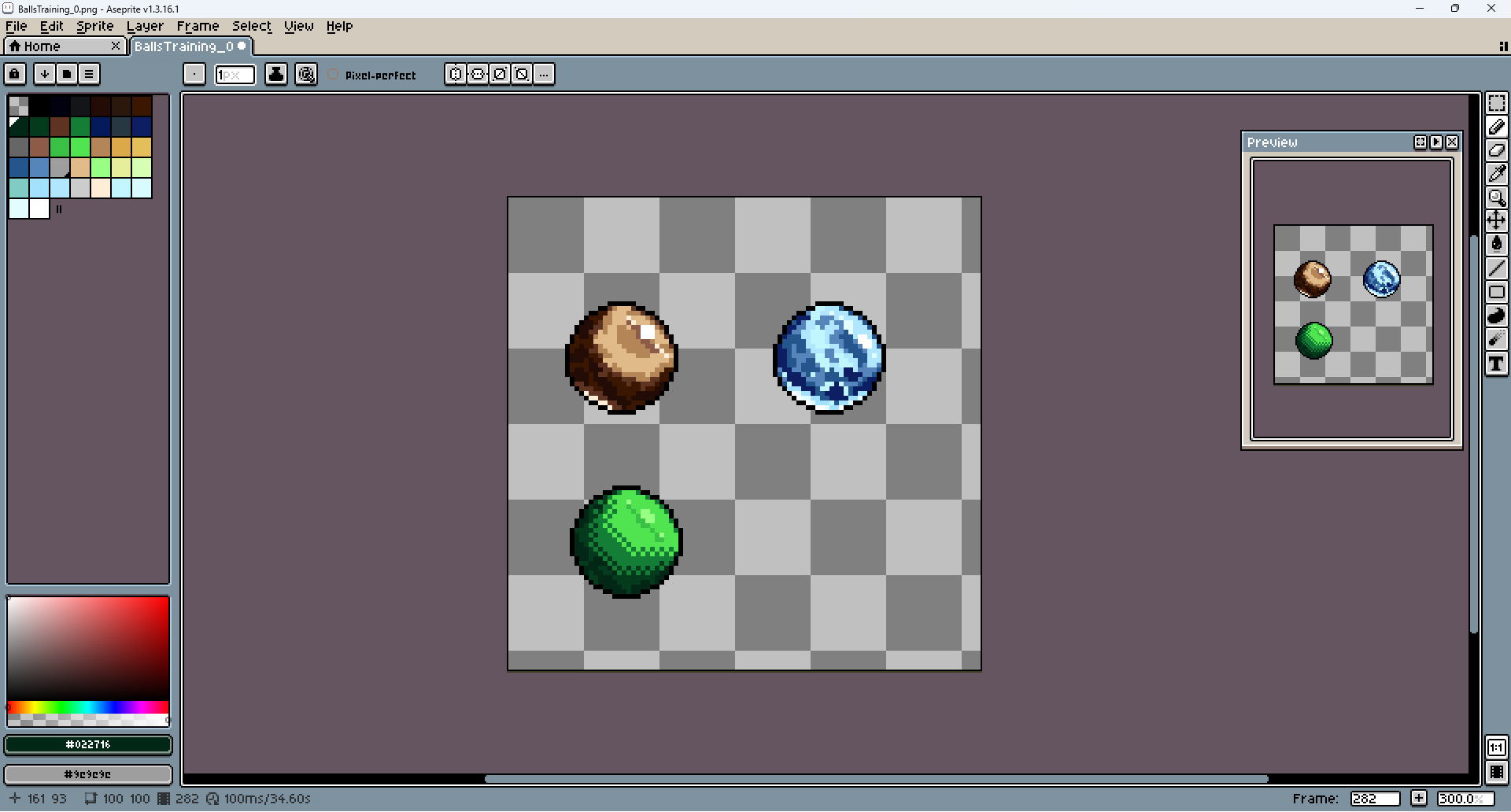
Now my old enemy: ice... Oh man, I didn't miss making ice at all. And this one might be the worst I have ever made.
Ice is very glossy but rough at the same time (I know it can also be smooth, but I had a rough ball of ice in my mind). That's why there is a lot of shine.
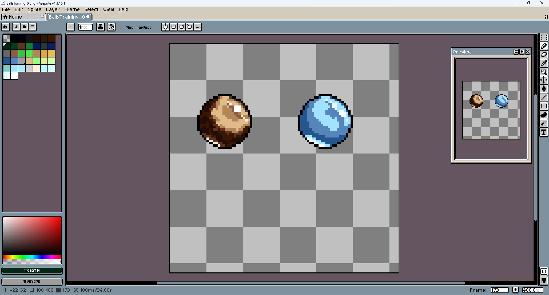
And a big, darker path under it.
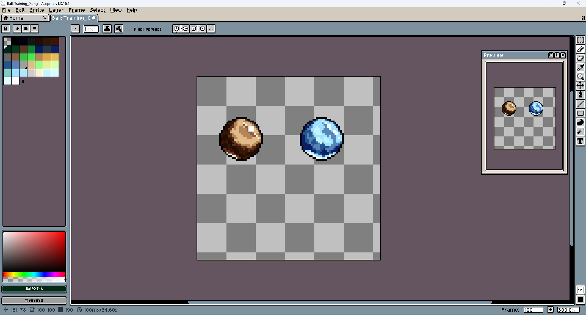
I think that I absolutely missed with the texture.
I tried to make it look reflective, but at last it just ended up looking smooth.

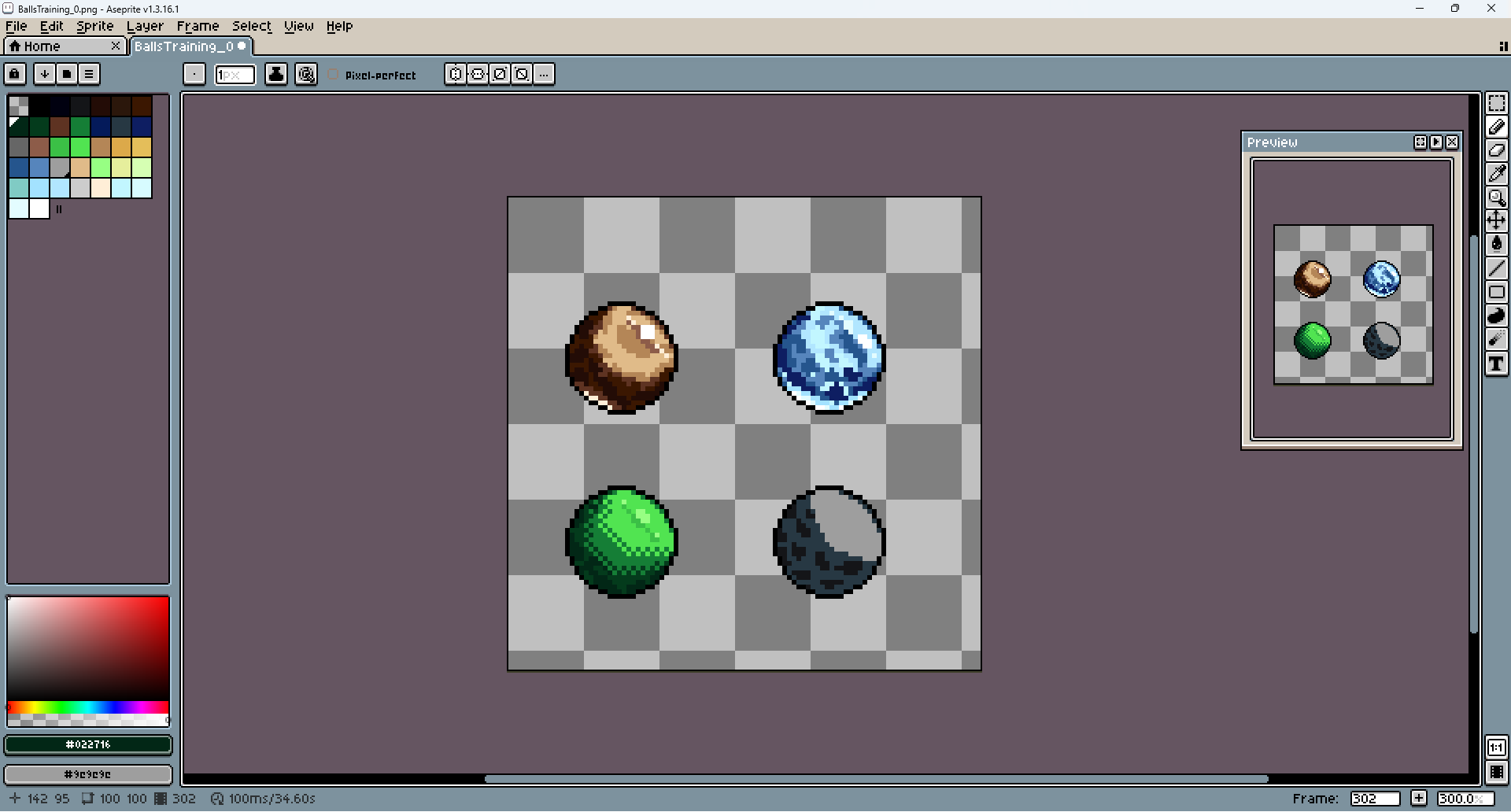
Next I wanted to make the green rubber ball.
Not quite shiny, but incredibly smooth.

That's why I ended up with the small checker box pattern.
The less you mix the colors, less rough objects look (at least that was on course, I hope you remember that I still have 0 idea what I am doing).

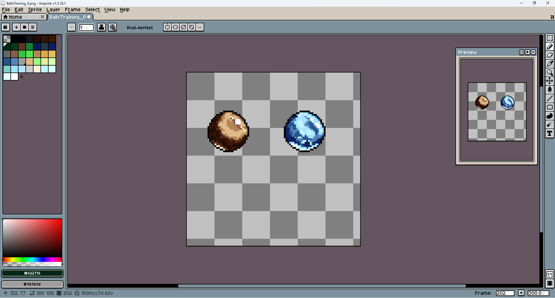
Lastly, cement. Just for something extremely rough and not shiny at all.
It's supposed to be the opposite of the rubber and ice. A big amount of small patches with different colors.
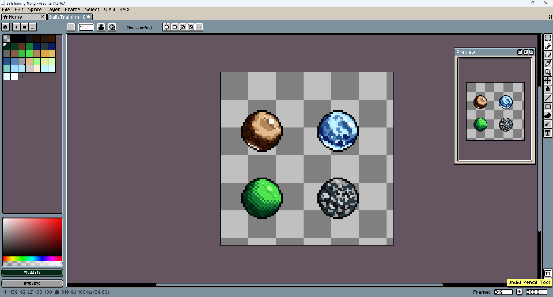
I went a little too hard on the color mixing here. You cannot see where is the light and where is the dark part.
I tried to make it more obvious by using more dark colors on one side and lighter on the other.
Added visuals for better presentation.
Yea, it took a while. Both the pixel and the post (two days and at least 5 tries). It's hard, I don't know why.
I hope you are doing well. I still believe in you!