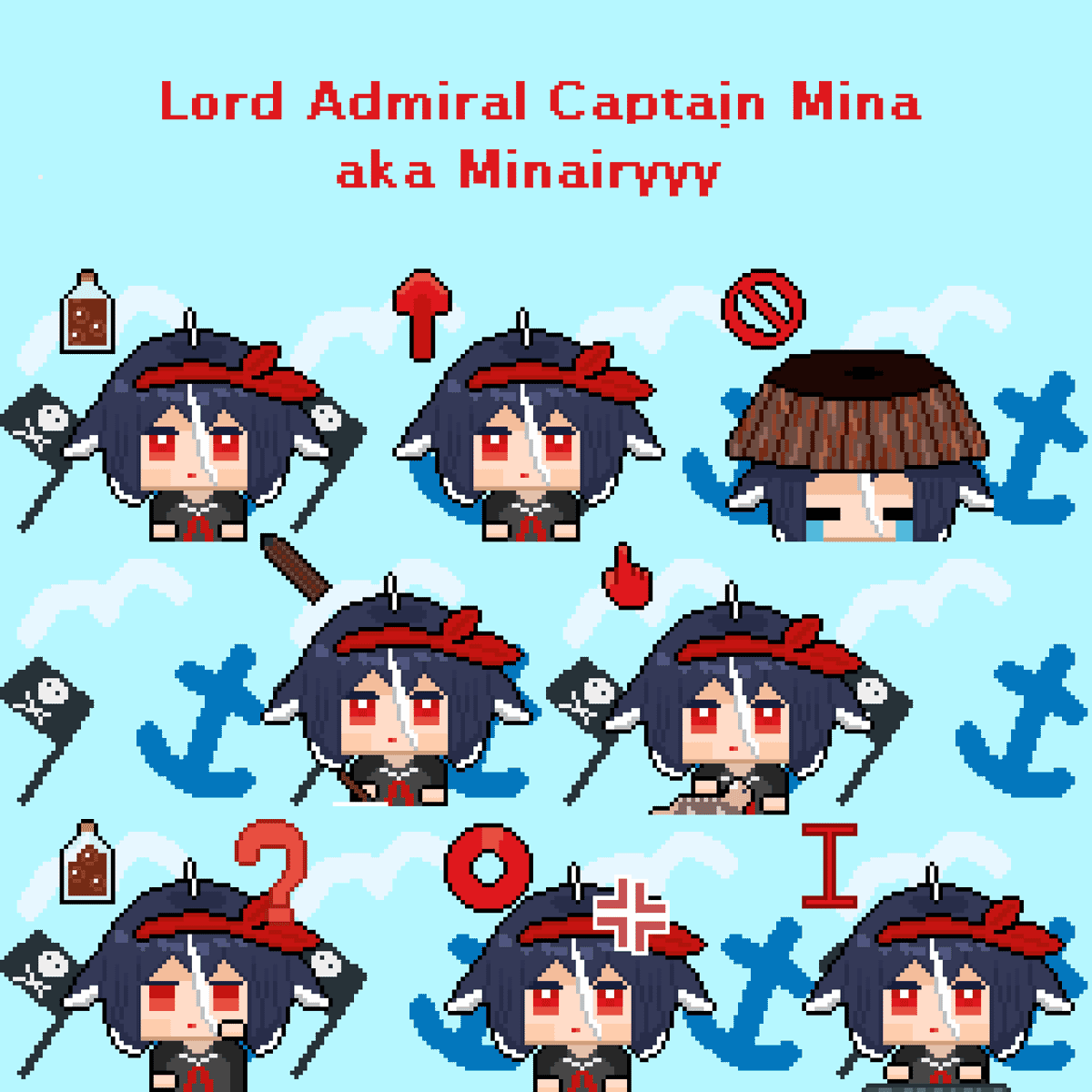
#63.3 Try, Kid, Try
This is the last post of the cursor trilogy. The shortest one too, probably. We already have the base ready and animated, now the only thing left is adding all those silly variations.
Most of the add-ons I used are pretty common. First, I'm lazy. Second, what type of cursor is showing has to be clear. It does not mean you can't go bonkers if you have some great ideas!
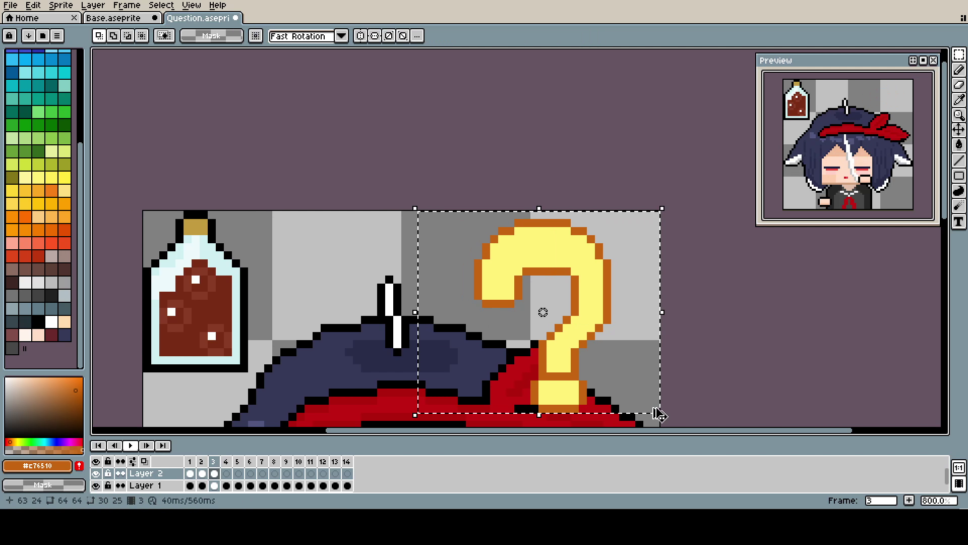
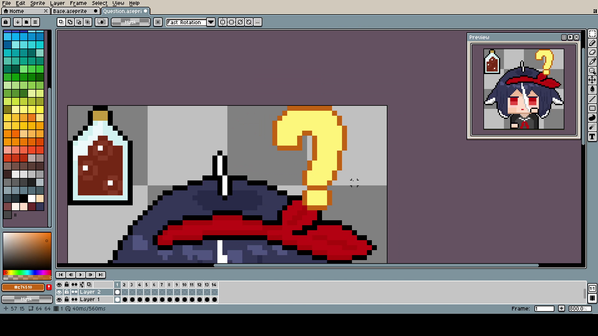
The question mark was done by simply shrinking and expanding it with the Marquee Tool. Maybe it's not the most professional approach, and you could make better-looking animation by changing it pixel by pixel, but I was kinda on a time limit, and it looks good enough.
The keyboard one is my favorite and simple to make. Make sure you have hands in a second layer, and move them up and down. To make it look better, make one hand a frame or two delayed after the other. I made the movement much too fast again: 6 frames is more than enough for such a small movement. If you want to use more frames, use double or even triple frames for every pixel of movement.
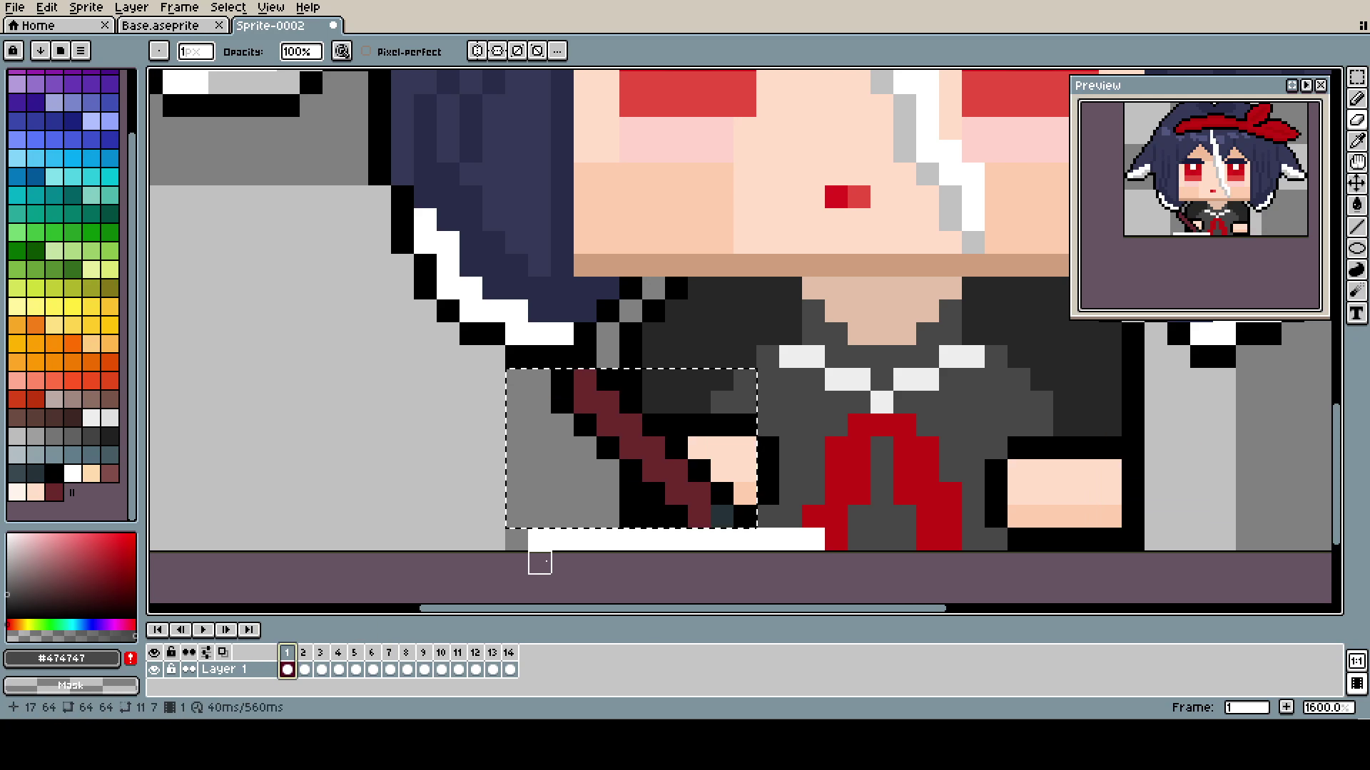
Here, I cut off the hands but saved them just in case (I'm showing the epathsite that making something like this is a creative process, your vision changes as you go, and it's smart to keep as many possibilities open as you can).
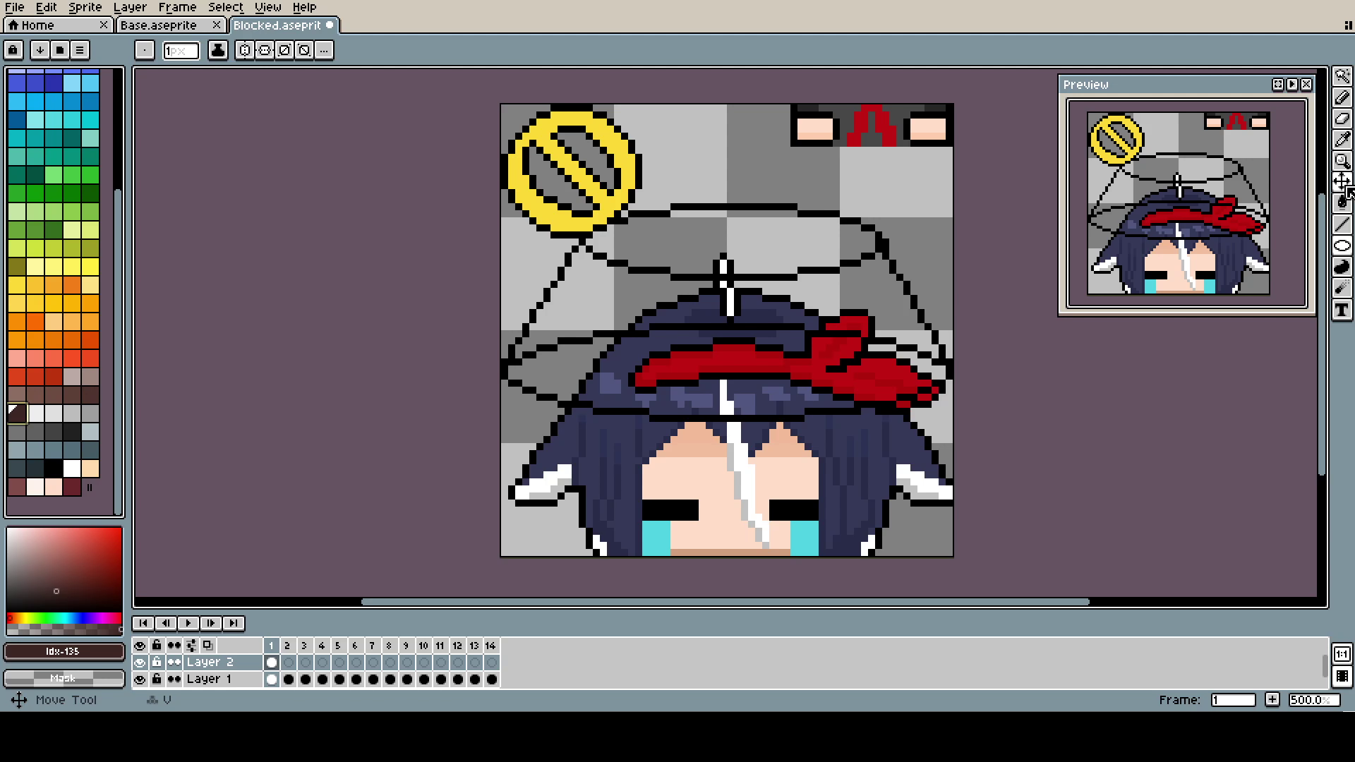
The Bucket (yes, capital B) is, of course, in a different layer than the head. Even if, in the end, they move together, it was much easier to pixel and adjust.
That's how the animation was made, just moving parts up and filling it.
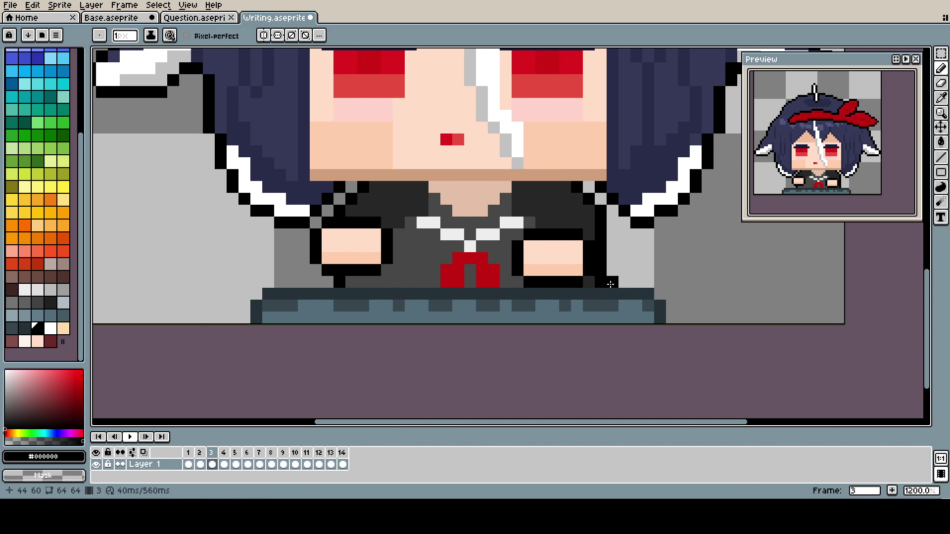
The writing one is also self-explanatory. Moving parts in a different layer (I know on screen it's in the same, I'm terrible at using my own advice, and believe me, it was a pain in the ass) and movement left and right.
Here, I was just roughly picking the spot where the last "light zone" ended and stating the new one from there. Once again: it's going too fast! Less frames, Citrus, less frames!
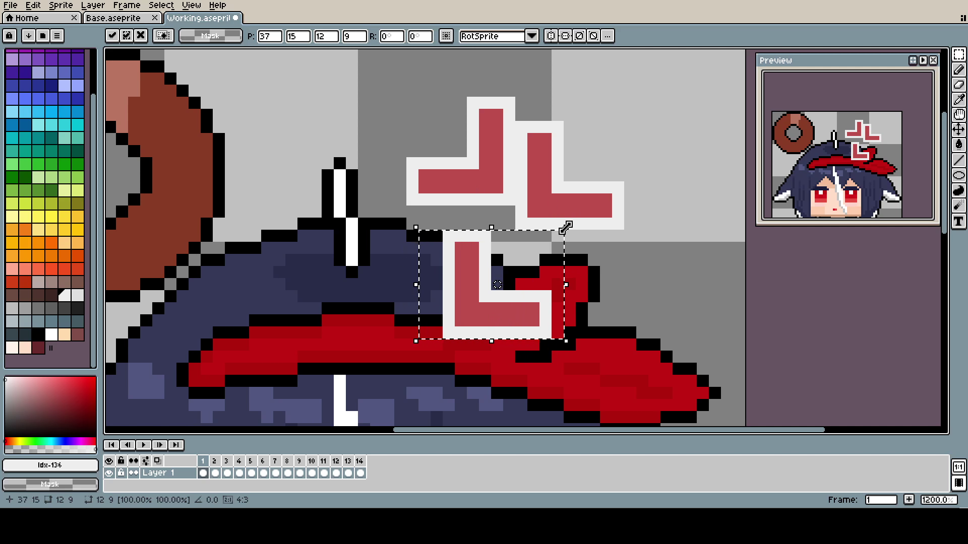
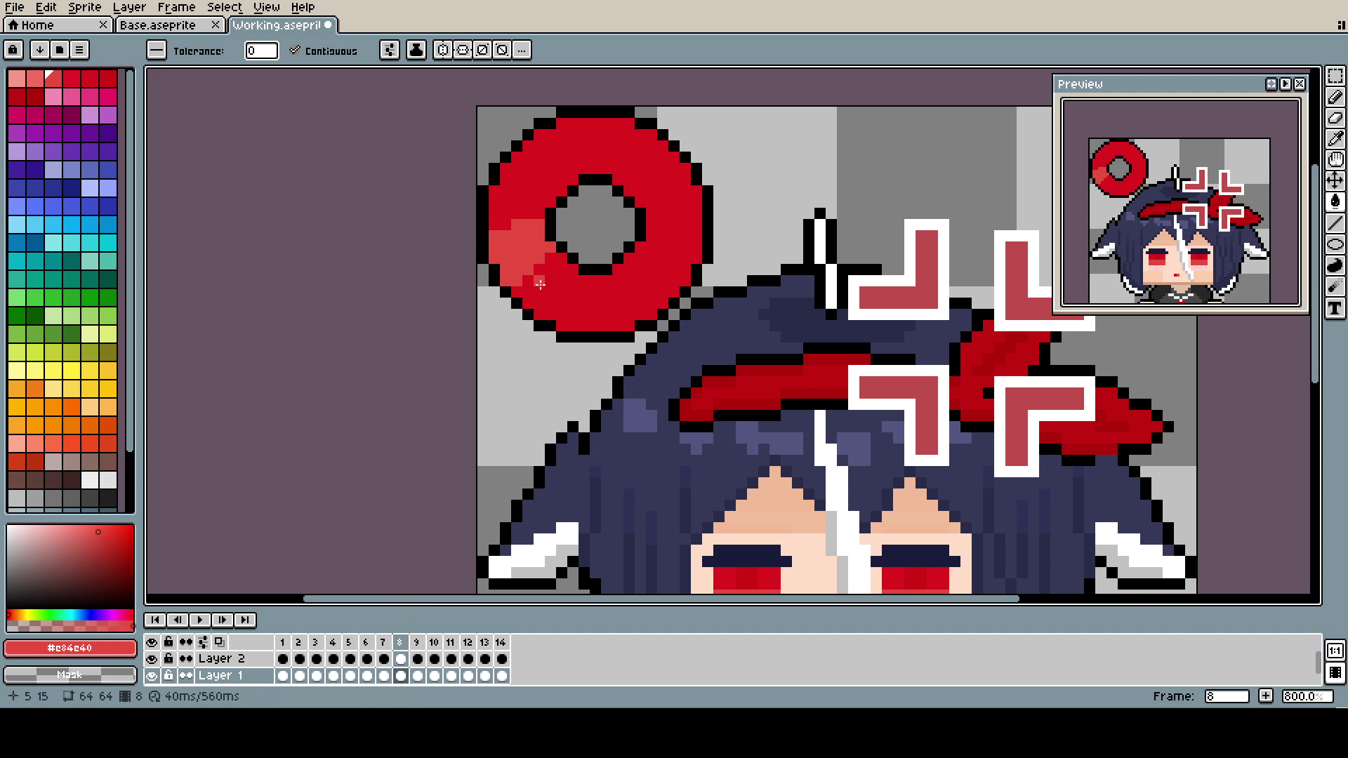
"The angy" is just one L copied and rotated and later moved, all using the Marquee Tool.
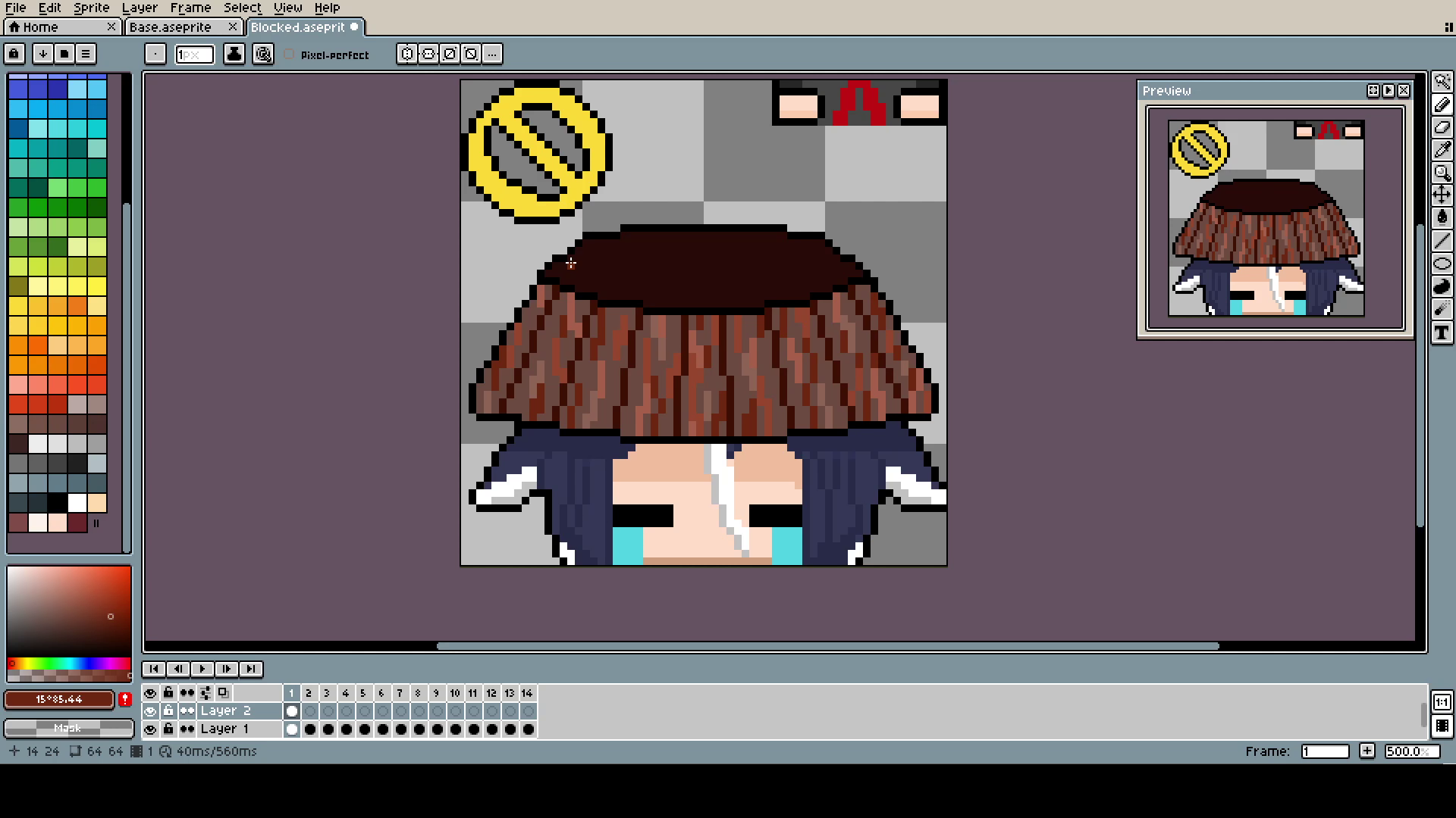
The colors yellow and brown were placeholders, for some reason I could not figure out what color I should use.
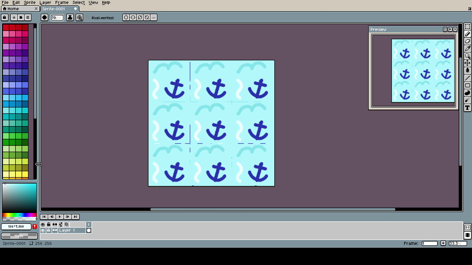
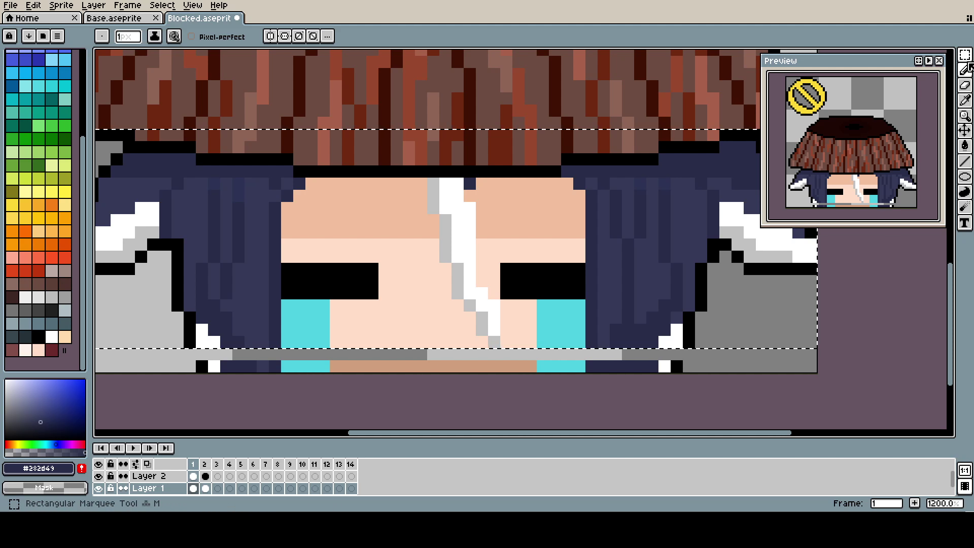
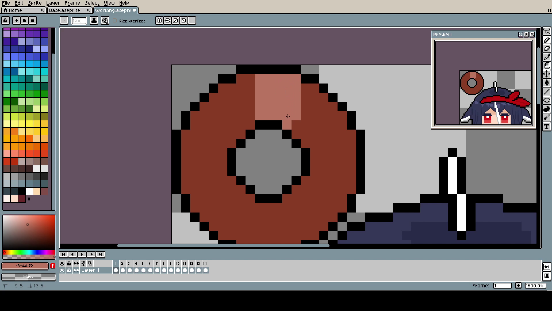
The background is simply one 64x64 pixel, copied 9 times on a 256x256 canvas. Remember that pixels scale by fours, not by twos.
See? It's not that hard! A little bit of self-loathing and rage, and you will easily make your own cursor with whoever you want.
As a bonus tip, for converting GIFs into cursors, I used Greenfish Icon Editor. It allows to use 64x64 canvases without destroying the quality. Windows automatically tries to downscale every cursor to 32x32, but if you change the cursor size in settings to 2 or 200% it should work just fine.
Thank you for reading all of this. I hope you are doing great in this new year. Maybe this will be the year when I will be able to finally keep the proper posting schedule... who am I kidding... that's impossible.